presentation

The Challenge of Titling Artwork

Giving titles to artwork is a challenging but rewarding part of the creative process. Although I am sure that there are many artists out there who have no problem coming up with titles, there are many others for whom it is a difficult or thankless task. I've talked with artists who hate assigning titles, and often default to "Untitled No. XXX" for their work. This is, of course, an option, but one that can work against an artist in certain respects. First, it can make it challenging to figure out which piece a potential buyer or curator is talking about unless you are an artist who has a great inventory system that allows for quickly finding your artwork in your archives. The longer you make art, the harder it may be to identify and find an untitled piece without a detailed and up-to-date inventory database. (I'm speaking from personal experience here.) Second, it can turn off certain viewers and buyers who welcome titles, as they can add meaning or provide insight into the work.

It is this value-added aspect of titling artwork that makes me work hard at coming up with an effective title. Titling forces me to engage with my art in a different way than when I am making technical or aesthetic decisions about it. I title all the artwork that I exhibit, making sure to title each body of work, as well as each piece within a series.

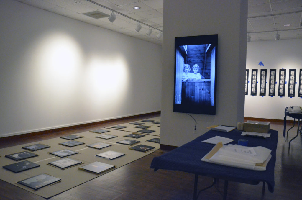
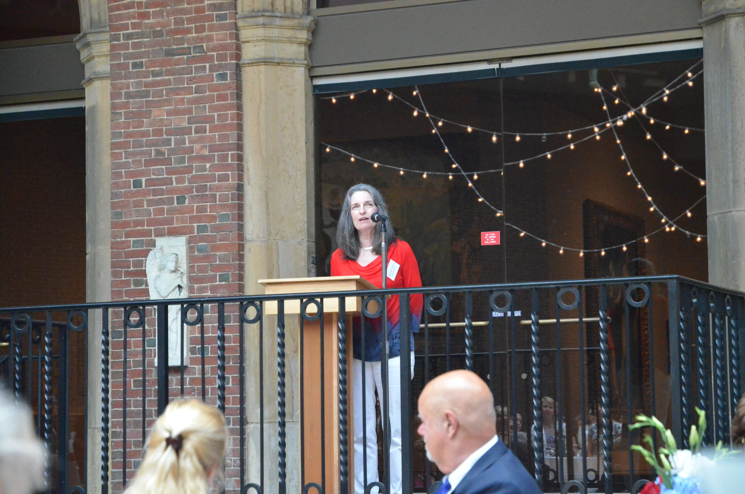
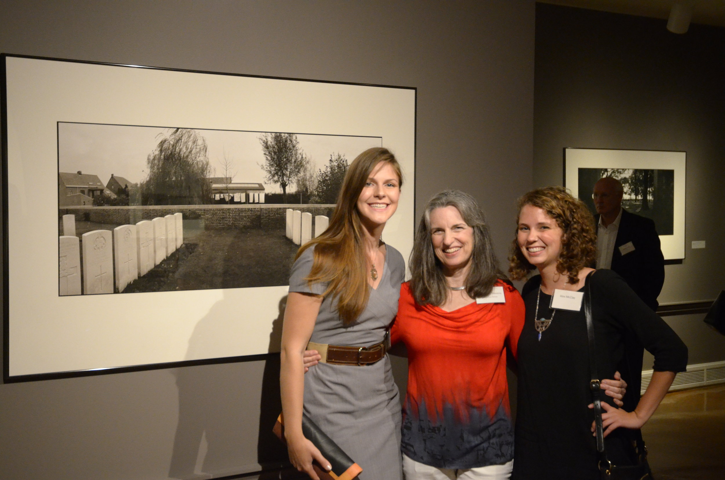
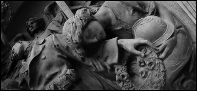
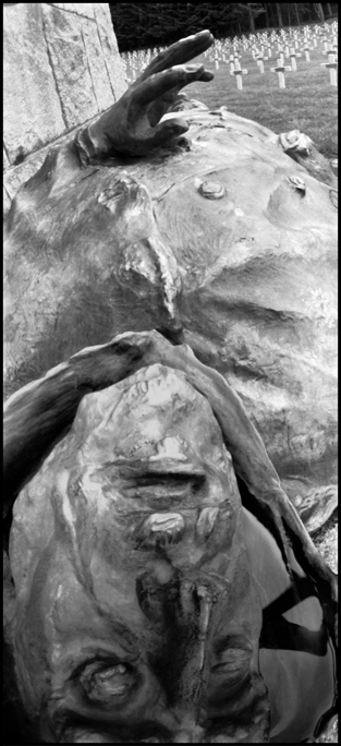
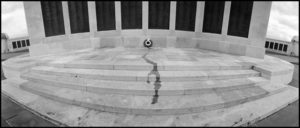
Sometimes titling is really hard. This was the case for the overall title of the body of work that became "Tears of Stone: World War I Remembered". I agonized over what the title should be, making long lists of potential titles, all of which were lame or awful. It wasn't until I was passing by one of my bookcases and my eye fell on a Chieftains CD titled "Tears of Stone" that I had a eureka moment. Conversely, sometimes titling is drop-dead easy. This was the case with each image in the "Tears of Stone" series.  Rather than give the pictures metaphorical titles, I knew that many viewers would be very interested in the type of place and the location at which each shot was taken. The location would further indicate the scope of the war's impact the nations that fought in it. Here's an example:

00-BW171-11.12-Lttr.-72dpi-300x128.jpg

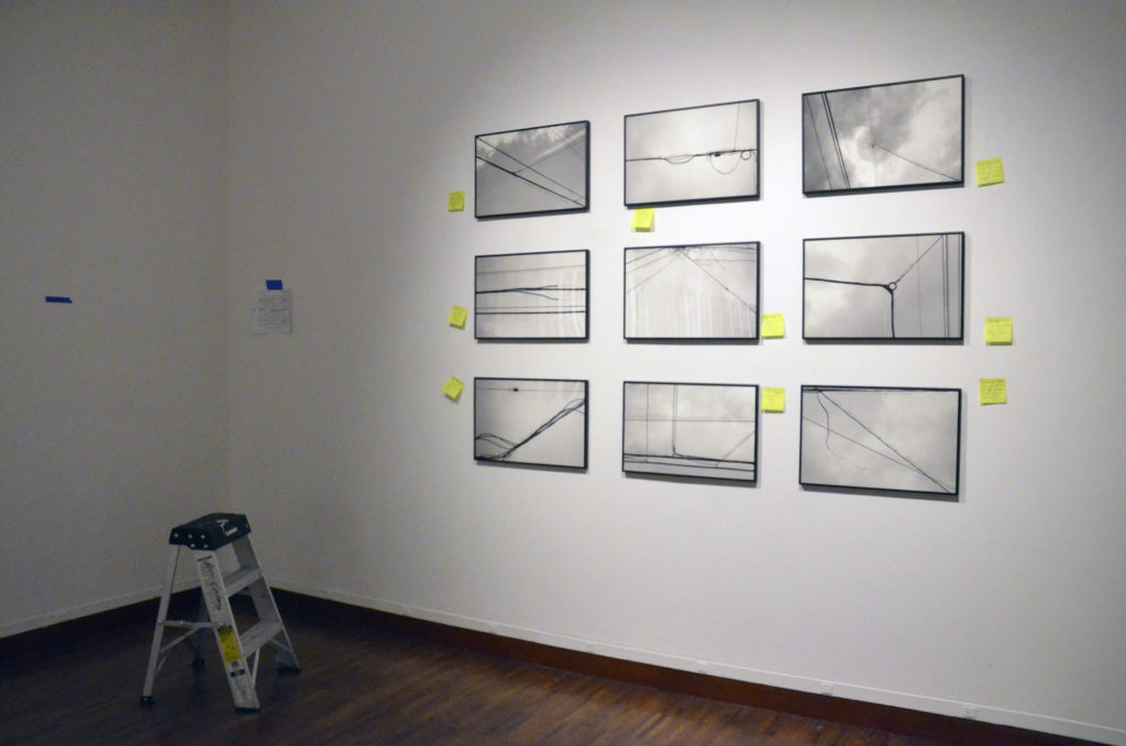
On the other hand, sometimes metaphorical titles can be very effective. Here's an example from "The Primitive Streak" series that functions both literally and metaphorically, and which depicts my nieces as they neared the end of their childhood:

96-P3-9.6-V7-Exhib.-4-300dpi-300x106.jpg

How do you come up with a great title for a piece of art? For me, it varies. Sometimes it comes from an external source like a discussion I have with a friend, a line in a book, newspaper, poem or song, or from listening to a podcast, as happened with the two series "The Wind Telephone" (This American Life) and "The Primitive Streak" (Radiolab). Sometimes a title is suggested by the artwork itself as I work on it. Using a thesaurus can be enormously helpful. I now keep an ongoing list of potential titles, knowing that I may never create a piece that matches up to one of those titles.

The main criteria I use for judging whether a title is effective or notis, "Does it add something to the experience of looking at the art without explaining too much?"

There really isn't one defining formula for creating successful titles for your artwork. Here are three different blogs that make excellent suggestions:

http://www.nicholaswilton.com/2014/08/06/how-to-title-your-art-so-it-sells/

https://renee-phillips.com/think-titles-art-matter/

How to Find the Perfect Title for Art

The Thread in the River- Installing the Show

To say that I have been buried in the preparations for this show the past few months is to make a gross understatement. The pace has been non-stop, but it has all come together without any last-minute disasters, which is a miracle. I went down to the Alice F. and Harris K. Weston Art Gallery today to help with the layout of the work as it is installed. Since virtually none of this work has ever been exhibited before, I am beyond nervous as to the impact it will have once it is all up.

Installing "The Thread in the River" exhibition at the Weston Art Gallery, Cincinnati, OH

The show consists of 6 different bodies of work. Will all of those series make sense when seen together in the same space? Does the order and presentation of the work help the viewer make sense of it? Is it a problem that 2 of the series are in color and 4 are in black & white? Or that two series are presented as videos and 4 consist of still images? Does anything need rethinking for future exhibitions? What's missing that could make it stronger?

Initial installation of "The Wind Telephone" series at the Weston Art Gallery, Cincinnati, OH

Only about half of the work was up today, and none of the labels were done, so it was hard for me to answer those questions. I'm going back tomorrow to look things over again, and might get a better sense of it then.

External Factors in the Perception of Artwork

I have written a number of posts about how the presentation of artwork can affect the viewer's perception of that art. The other day I ran across a fantastic video that speaks to the same issue as it relates to food. "Tasteology" is a series of four videos that address the issue of why food tastes the way it does. The first three episodes focus on the source of the raw ingredients, how they are prepared, and how they are stored. The final episode, found below, examines how the presentation and environment in which food is eaten affects our perception of its flavor and textures. From the room and the plating to the ambient sounds and lighting, this video speaks to an issue that all artists should think more about when considering how to present their work. I loved it! [embed]https://www.youtube.com/watch?v=0CDsifeDf-c[/embed]

FotoFocus 2016 Exhibition Preparation

Photography is now an accepted part of a university curriculum, but that was not always the case. By the 1960's and 70's, the medium had firmly established itself in art and design programs around the US, including those at universities in the Cincinnati Tristate region. I was fortunate to be one of the early professors in the program at the University of Cincinnati, along with Jerry Stratton, who founded the program. The other photography program founders in the region are Cal Kowal at the Art Academy of Cincinnati, and Barry Andersen and Barbara Houghton at Northern Kentucky University. This year for FotoFocus 2016, Cincinnati's biannual festival of photography,

[embed]http://www.fotofocuscincinnati.org/biennial/[/embed]

the Behringer Crawford Museum is hosting an exhibition of photographs by us 5 Photo Founders, and it has been fun trying to decide what work to put into the show. I finally decided to exhibit photographs from my Masters of Fine Arts thesis show, "Dancing on a Wall", which has not been shown since 1983. More on the work itself in a later post, but here are a few images showing the final framing of the work, which will be delivered to the museum later this week. The show opens on Friday, September 30.

Pulling the protective coating off of a plexiglas sheet

Fitting the top onto the rest of the frame

Piezography Workshop for Black & White Printing

My current project, titled The Thread in the River, is a mix of photographic media: film, digital, and video. I am creating a number of series, some of which are going to be printed in black and white. My Tears of Stone: World War I Remembered project was printed with  Piezography software and inks back in the early '00's, so I knew that that is the method that I want to print this new b&w work with. But a lot has changed since then and I knew that I needed a total reboot. So I signed up for one of the New Piezography Workshops at Cone Editions Press in East Topsham, Vermont, and traveled there last month for it. With participants from China, Japan, Canada and the US, it was a truly international experience. Throughout the workshop, Jon ConeWalker Blackwell, and Dana Hillesland each filled us in on different aspects of the process, including information about how to prepare image files, how the software works, printer setup and maintenance, and far, far more. We were able to print on a large assortment of papers using 5 different inksets. They did a lot of one-on-one work with each of us, as we all had come there with different needs and agendas.IMG_3408

In addition, I got to see Cathy Cone's photographic work, which is gorgeous and evocative. At the end of the last day, we spent some time at the waterfall nearby, then walked back to share wine, beer, and stories. It was a beautiful summer day and a fitting end to a fantastic experience, surrounded by people for whom craft is important. For anyone who is serious about fine digital black & white printing, Piezography is the way to go.

Photograph by Cathy Cone

Dear David Bowie...

Dear David Bowie, You have been on my mind a lot since you passed away two weeks ago. Not that you have ever been off my radar, but the event of your death has caused me to ask myself why I will miss you so much, now that you are gone. The author and journalist Charles Shaar Murray was quoted in the obituary that The Economist ran in its January 14, 2016 issue as saying: "I can think of no other rock artist whose next album is always the one I'm most looking forward to hearing."

And that sums it up in a nutshell for me. You were predictable in your unpredictability. I never quite knew what you would do next, and that sense of anticipation- of not knowing what was around the corner- was exhilarating. Whether it was in the music itself or the way you dressed and presented yourself to the world, there was always a feeling that you had discovered something before the rest of us and encouraged us to explore it, too.

Even your voice was unpredictable. It was unexpectedly powerful, yet it would quaver. As a friend of mine so brilliantly put it, your voice was "so striking because of the contrasting qualities of fierce self-assurance and bristling vulnerability." I sometimes would think that it wasn't quite in tune, but then it was. Where would it go next? I loved that I never quite knew the answer to that.

You were an artist who epitomized the idea that the best of art is based on a substantial foundation of knowledge and experience that is invisible to the rest of us, but which is necessary to produce your work. Always seeking, always curious, always telling us that it is normal to be different.

I will really miss you, Mr. Bowie. I'm so glad that you spent as much time as you did on earth.

Thank you for your art,

Jane Alden Stevens

Dayton Theatre Guild Production

Many thanks to director Kathy Mola and the Dayton Theatre Guild for their thoughtful and moving use of photographs from my "Tears of Stone" project in their recent production of "All Is Calm: The Christmas Truce of 1914". This moving musical interweaves songs from that era with excerpts from poems and journals by soldiers from both sides of the trenches who experienced the Christmas Truce in December of 1914. It deserves to become a staple for theater companies around the world during the annual holiday season. Kathy decided to project my images onto the backdrop of the set so that the characters appeared to actually be in the battlefields and cemeteries themselves. It was very creative and remained truthful to the spirit of the images. It was a great experience to collaborate with her in this way and a nice opportunity to have these pictures "speak" in a different kind of way to an audience that otherwise would not have seen them.

Dayton Art Institute Artist's Talk

Tomorrow (Thur., Sept. 17) I'll be giving an artist's talk about the "Tears of Stone" show currently on exhibit at the Dayton Art Institute. The show is up through Sunday, October 4. Here's a link with more information about the lecture, which includes a short video of me talking about one of the pieces in the show.

I've spent the past few days putting this talk together. In brief, it will include information about the research I did for the project, the technical aspects and challenges of shooting it, and I'll be reading excerpts from my field notebooks about experiences I had while working on the project. I'm really thankful for the opportunity to do this- it's been a while since I've made a presentation about this work, and it's nice to get back to it.

Dayton Art Institute "Tears of Stone" Show Opening

"Tears of Stone: World War I Remembered" opened at the Dayton Art Institute today. It is paired with "Call to Duty", an exhibition of United States war posters from both world wars. Banner announcing the two shows on the exterior of the Dayton Art Institute

There was a Member's Opening a few days ago, which was really fun, and which spoke to my appreciation of detail. Below is an example of the table decorations in the reception hall. Please note that this is an ammunition box with shells draped over it! DSC_2669


I had to make a short speech to the assembled masses:DSC_2686

Here are a few pictures of the "Tears" installation:DSC_2698 DSC_2702


Thanks again to Laura Fisher (left) and Alex McClay (right), without whom I wouldn't get half the work done that I do get done:DSC_2719

"Tears of Stone" at the Dayton Art Institute

My work on World War I remembrance, "Tears of Stone", is being exhibited at the Dayton Art Institute (DAI) from July 4 through October 4. I was able to travel there a couple of weeks ago in order to help train the docents and the show looks fantastic. The walls are painted a deep stone-grey that has slight hints of brown in it, which ensures that they enhance the tone of the photographs beautifully. Many thanks to the University of Cincinnati's Professor Theresa Leininger-Miller for bringing my work to the attention of the DAI and to Curator Aimee Marcereau Degalan, who has been such a pleasure to work with.

Thanks, too, go to my two assistants, Laura Fisher and Alex McClay, without whose help I would not get much done!

Alex McClay and I prepare a print for the DAI exhibition

The opening is in two days and I'll post more about it after that.

Pinhole Photography Exhibition in Santa Fe, NM

For decades, Eric Renner and Nancy Spencer have not only run The Pinhole Resource, they have also collected thousands of pinhole photographs and pinhole cameras from around the world. The Pinhole Resource Collection was recently accessioned to the Palace of the Governor's Photo Archives at the New Mexico History Museum in Santa Fe, and it is on exhibit at the museum until March, 2015. Two of my photographs (see below) are included in the "Poetics of Light" exhibition, which I was fortunate enough to see earlier in the year.

Municipal War Memorial, Ypres, Belgium

Le Wettstein French Military Cemetery, France

Although I am well-aware of the wide-range of technical and aesthetic approaches to pinhole photography, I was completely blown away by this exhibit. It is educational, enlightening, and awe-inspiring. Beautifully presented, the 40 cameras and 225 photographs made me want to go out and use my pinhole cameras immediately, even though I didn't have one with me. Interestingly, the show had the same effect on the three non-photographers I was with. We were all amazed at the range of possibilities this type of camera has.

I don't know if this show will travel, but I hope it does. Anyone who is interested in photography, analog or digital, should have a chance to see it. Here is a brief article about it in the New Yorker magazine, which includes some of the images and cameras in the exhibit.

Below is a (somewhat blurry) picture of the section of the installation that my work is in, which gives you an idea of what the exhibition itself actually looked like. (The camera displayed below my images is the same make and model that I used for shooting the "Tears of Stone" project.)

If you find yourself in Santa Fe anytime between now and the end of March, check it out. It doesn't matter if you are a (pinhole) photographer or not- it's worth it, regardless!

IMG_1039

Artists I Like- Diego Goldberg

Yet another entry in the "long-term project" list: The Arrow of Time project by Argentinian photographer Diego Goldberg. Every year on June 17, Goldberg and his family members make an individual head-and-shoulders portrait of him-or-herself and place them on a timeline. 1976. Diego and Susy.

Over the years, the timeline has expanded to include the addition of spouses, children and grandchildren as they were born.

1984. Diego, Susy, Nicolas, Matias, Sebastian.

One of the most interesting aspects of this project is that the pictures are presented vertically, thus allowing the viewer to look at the face of only one person at a time through the years. At the same time that the viewer's eyes take this in, one is still completely aware of the other faces on the periphery of one's vision. It's almost as if the others are lurking, daring you to see them.

2014. Diego, Susy, Nicolas, Matias, Sebastian.

Another aspect of this work that intrigues me is the singularity of the family members. They relate to each other only because each photograph in any given year is placed adjacent to the others, not because they coexist in the same physical space the way that Nicholas Nixon's "The Brown Sisters" do. Goldberg and his family members each stare out at the viewer, giving us no sense of their connection to each other.

This project is a great example of how the presentation of photographs can create meaning, and how repetition can do the same.


Thoughts on the Aesthetic Experience

When writing up my last post about the importance of presentation in relation to the viewer's reaction to art, I was reminded of an interview that a former student of mine and fellow photographer, Kayla Wandsnider, conducted with me a few months ago. She was curious to know my thoughts on the nature of the aesthetic experience. I told her a story that once again speaks to the power of context and presentation in the experience of art: KW: I believe that environment can play a substantial role in an aesthetic experience. Do you think that this is true?

JAS: Yes, totally. An experience I had in Salzburg, Austria, comes immediately to mind. It was a very gloomy, rainy day and I was cold and wet and tired. While walking down a narrow street in the inner city on my way back to my hotel, I decided to go into a church I happened to be passing. The building was nothing special on the outside- in fact, it was so plain that I almost didn’t recognize it as a church. I went in because I simply wanted to sit down and rest for a while.  At the exact moment that I entered, the opening chords of Bach’s Toccata and Fugue in D Minor rang out unexpectedly, filling the church with glorious sound that seemed to cascade torrentially out of the heavens. At the same time, light poured down through the church's long, slender windows, in stark contrast to the overcast gloom outside. I was completely paralyzed with shock. I hadn’t expected it to be so light inside, hadn’t known that music of any kind would be playing, hadn’t anticipated that I would suddenly be experiencing something so moving, so beautiful, so arresting. I could hardly breathe, it was so overwhelming.

I sank slowly into a pew as the music continued to play, not really seeing anything, living completely in the moment. It felt like time was suspended.

The combination of the location, the weather, the light, the music, my physical state and, yes, the unexpectedness of it all, led to one of the most profound aesthetic experiences of my life. And it wasn’t about the church building, it wasn’t about the music itself, it was an experience that came about because ALL of those things put together transported me to…. Somewhere Else. I will never forget it.

Click here to read the entire interview.

The Importance of Presentation

There was a great article in the New York Times a couple of days ago that ruminated on the nature of museum artifacts and the power they have to emotionally move viewers, as well as to intellectually stimulate them. There are a number of shows currently up in NYC that succeed at these tasks more or less successfully. Part of the article discussed that the manner in which these artifacts are presented to the public makes a huge difference in how the public perceives and experiences them. If one can view the artifact in close physical proximity, "The artifact becomes a spur to the imagination: It reveals history as something lived, and thus as a result of choices made. We come more alert to the ways things are, and how different they might yet be..."

But, it goes on to say:

"If an exhibition is staged so we are placed too close to another world without being given tools to make sense of it, the effect is disorienting rather than clarifying. The artifacts can amaze, but we can't use our imagination to go further."

Exactly! The full article can be found here.